Note ![[Rebol and Red] chat room](http://i.stack.imgur.com/VIh6w.png)
If you want to come join the planning for Rebol's identity, much of the conversation is happening publicly, in the StackOverflow chat room:
It's a place for conversations about the languages of all kinds, and there's even a RebolBot that can evaluate expressions!
After decades of pondering and implementation, the Rebol programming language quietly went open source on December 12th, 2012 (12-12-12). The language's chief designer, who was one of the designers of AmigaOS, had this to say:
You probably thought the source release would never happen? Am I right?Well, it's there now in github. This is preliminary. Once I know some of you have built it successfully, I'll make a more public announcement and add a tarball for download from rebol.com.I'll check in here for several minutes every night to respond to any questions.Let's see what happens... Who will be the first to port it to Android?
Within 8 days, German developers at Saphirion had made an experimental Android port. I myself made the minor patch to get Rebol building on HaikuOS. Instructions then came down the line for building on Raspberry Pi, Beagleboard, and Pandaboard.
As people began absorbing the good and bad of the first-ever-sighting of the source code for Rebol, wheels began to turn. By request, one of my pet projects (the redesign of the Rebol logo) was thawed out of its 3-year hibernation.
I won't repeat the long-winded-argument I made years ago for Rebol Technologies replacing its old icon:
...with a new icon that I created based on Rebol's heritage, as well as the notion of bracketed series of words (as in [o]):
Rather, I'll just talk about the issues involved in staging a "design intervention". of this nature...
Requested Help vs. Unsolicited Help
Note
I was not asked to work on Rebol's graphic design. Rather, I was motivated to address it because of how quickly those I pointed to rebol.com dismissed the interpreter, based on surface judgments about the website design and the logo. It was, at that time, also proprietary and closed-source, and so as far as evangelism was concerned it suffered a death by a thousand cuts.
It's a little complex to think about the legal issues when some random person on the Internet offers you stuff (like graphic designs) when you didn't pay them or have any kind of contract. Who owns it? Even if you do like what they've sent, will it cause problems down the road by accepting it? What if their ideas of licensing rights and copyright law differ from your own?
In this case, I've tried to be as unambiguous as possible. I designed a logo for Rebol, specifically. The design depends on the use of square brackets in the language, and extending the classic Black and White logo (which needs a modest update as well):
I'm pleased with the design in the context I made it. But if I were to make my own interpreter, I'd use a different name and draw everything from scratch.
Thus in my mind, in "God's great big filing cabinet of ideas" (or however you want to think of it), this belongs to Rebol. As such, the benevolent dictator who controls Rebol's trademark should also control the graphic. I have no further interest, and publicly testify to signing this over Rebol Technologies (if they accept), to be protected in parity with the trademark name [Rebol/REBOL/REB[o]L](http://www.rebol.com/article/0525.html).
Note
Beyond naming and iconography, the source is Apache 2.0 so you can do pretty much what you want...as long as you don't call it Rebol without getting permission!
This is actually not so different from what open source projects typically encounter; a designer who offers their work to an open source project must sign rights over to the foundation controlling the code. So whether you drew the FireFox or perhaps won the competition for Apache Flex, you hand over the rights. You can derive something from the Firefox codebase but you can't call it Firefox or use the logo in a way they don't approve of...same for Chrome, Apache, Ruby-on-Rails, you name it...
In this case the mark isn't going to a non-profit, but I'm totally okay with that given the direction things are taking now.
Competition and Evolution in Open Source Design
Many professional graphic designers are annoyed at the current trend of "logo competitions", where designers are asked to submit their ideas for free and then they will be compensated...but only if their design is picked. They consider this to be "giving work away for free" and campaign against it on matters of principle. It's a thorn in their side that some newbies still participate in that skewed economy, at the risk of their own time and jeopardizing the industry.
Note
This may sound familiar, considering the battle between print journalists vs. bloggers...
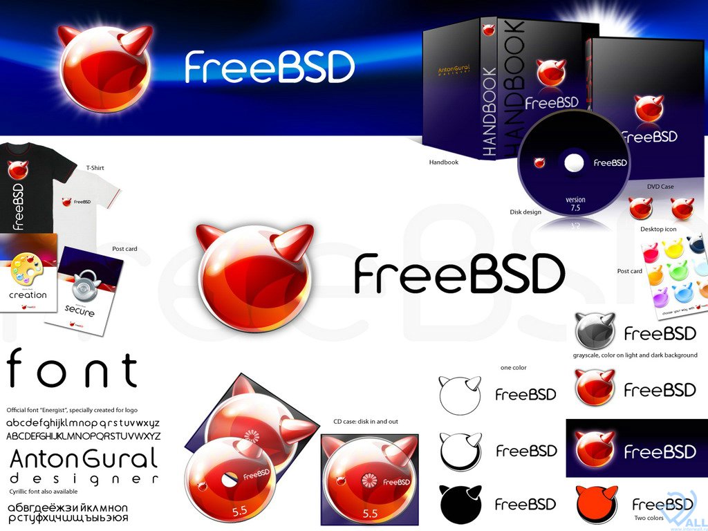
The open source world--however--is deliberately turning many socio-economic ideas on their head. And it's more common than not that the community will throw in ideas and let people pick the best ones, even when those ideas aren't "code". My first memory of seeing this crowdsourcing in action was the redesign for FreeBSD. Similarly to the Rebol project, there were many years of history and a "cute" mascot (the BSD "daemon"/"beastie") whose heritage needed to be brought forward:
The winning idea was more geometric...it made a kind of sphere with horns:
Since the competition happened so long ago, it's hard to find what options there were to the design...as newsgroups are archived more readily than graphics. But there were people who liked it, and people who really didn't like it. There's a big problem with logo design in a vacuum which is best summed up by the phrase: "De gustibus non est disputandum" ("There must not be debates in matters of taste.")
This is where things get complicated, and why I am so adamant about removing the focus on whether you like something or not to whether it is serving its purpose or not. I've been following graphic design for about eight years now, and the purple target sign overlaid on a red background with a generic R on top of it does not please me. HOWEVER if the data showed that intelligent programmers worldwide were receptive to it and didn't like my logo...I'd have to bow my head and say "arrite, guess my ideas don't fit your market."
Thus far, that's not what the data indicates.
Naysaying to What I've come up With
It's easy for ten people to dislike something. But when critics try to come to a consensus about what they disagree with, they often find the only thing they agree on is being disagreeable!
There's a very poignant scene in Ratatouille when Anton Ego remarks that the job of a critic is easy, but a critic really shines when they stand up in the "defense of the new":
It's easy to agree on something that does not exist. The brilliant cartoonist who goes by "The Oatmeal" has captured the evolution of this issue very well in "How a Web Design Goes Straight To Hell".
But in any case, no Rebol logo competition was ever started by Rebol Technologies, Inc. While I have no multi-million-dollar client portfolio to "prove" my genius, I have never appealed to any authority as for why my logo is more meaningful and useful. I just made my arguments on a wiki and none have come forward to challenge me. Most everyone has liked my design but a concern has been stated:
What I really think is, that you might create an unnecessary push to accept your design. It is not bad by any means! The only thing I claimed is, that it is not only about a logo, but also about the pictogram, the web, the business card, envelopes, presentations, etc. But - RT as a company will not be probably active, so those might not matter much. OTOH, when thinking about the logo, all those aspects should be thought about ahead imo and should simply fit.
My own opinion is that it is a motif...and such a flexible one that it can even be rendered textually as [o]. A web designer or business card designer should be able to have a field day with variants on this. I've been waiting three years for a challenge, and my arguments have been laid out...but at some point we have to move forward! I feel that moment is now.
A friend of mine says it's like the movie "Matrix" where you are offered either the red pill or the blue pill. Most programmers stick with the blue pill. The folks who take the Rebol red pill wake up and can never go back. I've had companies call me to complain that a few of their programmers started using Rebol and are now "ruined" because they refuse to go back. Rebol is a highly disruptive technology.
The real red pill is intention. And if you use a language like PHP that is an actual Fractal of Bad Design, then you will indeed be taking a very literal blue pill:
Those stuck in The Matrix will not think one way or another about that blue pill metaphor, or how grotesque the kerning is that pushes the "h" closer to the left "p" than the right one. But anyone familiar with architecture will back away slowly...and then run to the nearest Exit. (Which is, interestingly enough, exactly what you should do if someone suggests using PHP!)