Note
This was is an archive for a wiki page that I had written, summarizing my redesign project for the Rebol logo. Despite being a wiki, I was the sole author of the content (despite talking about myself in the third-person).
The original link was at
http://www.rebol.net/wiki/REBOL_logo. That wiki is currently down, and has been for weeks. So I have copied the material from the Internet Archive's scrape dated 2-Oct-2013. I've also added some extra notes.
(The design itself dated to late 2010, I'm pretty sure. I don't know the exact date the wiki was made, but if it comes back online, then I'll put the history log in this file as well.)
There have been two different icons used for Rebol. One is white letters in a Rounded rectangle, with a white target for the O:The second one is a white R inside of a red square. It is used for the program icons on installation, as well as the little 16x16 "favicon" that appears in web browser tabs when visiting rebol.com, .net, etc.Logos can go a long way in communicating something about one's image nonverbally. If one is going to spend a decade developing a programming system then it's worth taking some time thinking about what an effective logo for that language would be. This page is for discussions of a new logo design that would be property of Rebol Technologies and the same control over using it would apply as in using the Rebol trademark, so please only contribute suggestions that you are willing to release under that understanding.Issue: Similarity To Target Stores Logo
What should immediately grab anyone is that Target has already made the target-like visual element a very recognizable national brand (furthermore they have built that brand up as "affordable" and not "Quality", so not the kind of image you want.)Any graphics effort for R3 which carries this motif forward should be sensitive to that similarity and excise it wherever possible.Issue: R in a Square is Generic
The Purple target is difficult to see in the red, but more generally, it's just not emotive. For many, this evokes power-ups from old shoot-em-up games:It would be nice to give people a metaphor to hold onto...some visual allusion to an idea. With a name like "Ruby" and a graphic that is a Ruby, programmers can at least think the code they make is precious... hardened. The back-to-back snakes in the Python are suggestive of a yin-yang almost, "programming as spiritual act". So something to hold onto here that communicated more than "Rebol starts with R" is important.Target Store is why "Rebol hits the bullseye" won't work, otherwise it might've been okay.Issue: Capitalization
This is a consideration in general to think about in terms of Rebol's image. It's a hard habit to break, but it really does affect perception. Though Rebol has nothing in common with the much-disliked language COBOL, the name does bear an unfortunate similarity. Using all caps is just asking for people to think they are in the same group.Other languages have taken a strong stand on not being capitalized and seeming like an "acronym name". For instance, the main FAQ that ships with Ruby even says:Officially, the language is calledRuby. On most systems, it is invoked using the commandruby. It's OK to use ruby instead of Ruby.Please don't use RUBY as the language name.Originally, or historically, it was calledruby.Note that Ruby was never an acronym, while REBOL always has been, so that position makes sense for Ruby. The only reason that acronym-style language names seem archaic now is that most of the popular programming languages that have been created recently have names (like Java, Python, Ruby or Perl) rather than acronyms (like PHP) or random characters (like C#). @HostileFork's proposal is that the acronym REBOL be changed to the name Rebol.Anyway, as far as this affects the logo... it may not at all. Capitalizing a word in a logo is different from capitalizing it every time you say it in a sentence (visually disruptive). But perhaps worth it to think about how the logotype uses case may send a certain message about making the language seem "archaic" (instead of futuristic)... some typography experiments of using mixed-case Rebol should probably be considered.Also, there is yet another case to consider: the language name is not pronouced as an acronym (i.e., as R.E.B.O.L). An example of such case may be the word "laser" which originated as an acronym but became a "normal word" afterwards not reminding that it means "Light Amplification by Stimulated Emission of Radiation".HostileFork's Bracketed O Proposal
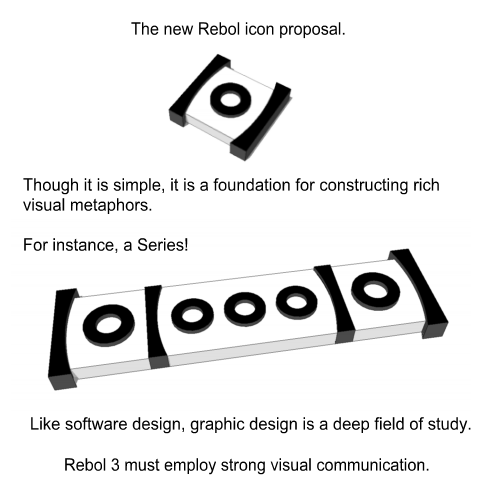
As a way of carrying forward history and adding a bit of pizzaz, @HostileFork has proposed the following concept art:This design represents an extraction of the portion of the classic logo near the "o", and would replace the white-R-in-a-red-square entirely. The more subtle curve around the "o" than in the original black and white logo leads the edges to look more like brackets, and de-emphasizes the similarity to the Target bullseye.It can be scaled down and still be seen clearly, here it is around 128x128:Depending on context, the shadow may be desired or not...and possibly done with alpha.Suggestion of a Series
There are some fun visual suggestions here. (Note: images were made using an earlier prototype of the logo.)Color and Stylistic Variations
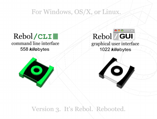
Variations can exist for core (green screen or "Tron" outline looking?)...alphas (red, dangerous looking?). It's possible to and it is something that has its own look and motif while still being rather simple. (Note: kbyte numbers fictitious as who knows what the finals will be):
Note
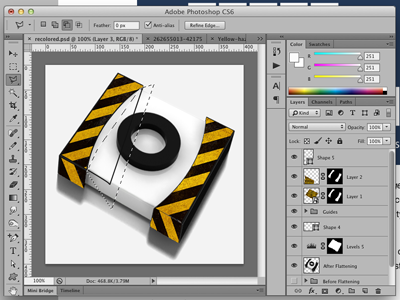
Later I suggested that the alpha/beta builds might use black and yellow construction stripes instead of just the black for the brackets, which I think would be a good direction for those builds:
I still think it's a good idea. But we need a better 3D modeling way of doing it, vs trying to do it by hand.
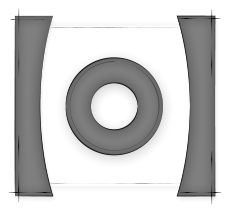
Being three-dimensional is not critical to the design, as it works well in two dimensions also. Christopher Ross-Gill offered this sketched frontal perspective, showing another stylistic interpretation.
Note
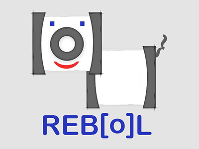
The Internet Archive apparently didn't catch it, but at one point I put a version of Chris's logo redrawn with @dt2's "Rebol Dog" idea:
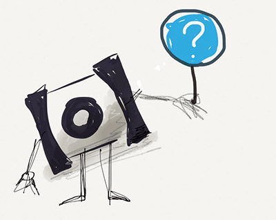
It's ridiculous, yet still memorable. Perhaps it could be used for some kind of "friendly" tutorial or book? Another whimsical contribution was "Helpy" by @rgchris:
Some people strongly disliked Helpy. But I thought just having a sketched logo with arms and legs like that could be good for some web theme.
Why curves not brackets?
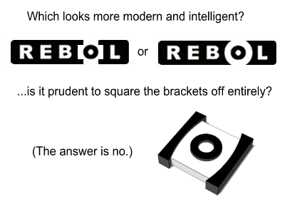
As for why not to go all the way to brackets, that doesn't look good in context:HOWEVER it would be good to make the curves subtler to hide that Target resemblance.Favicon
The iconography can be reduced to a favicon reasonably, like this:While in general @HostileFork favors bracketing which lies on the spectrum between completely squared and rounded, the favicon is a very limited 16x16 medium. Accepting the limitation and squaring them is probably for the best to get a decent image, and it makes a stronger mark. Kind of like how in text mediums it might be rendered as [o] and still convey the idea in a non-ideal way. A refresh of the classic logo to excise the Target mark and strengthen the bracketing association would be nice.Here is a closeup of the actual .ico file. Hand-drawn antialiasing is used to kind of extend the brackets up a bit to extrude, while leaving a transparent gap for the browser's (usually-but-not-always-gray) background to show through.Font Used in Classic Logo
In researching variants of an updated logo, questions have come up as to what the font in the original logo was. The R, E, B, and L seem to be a slight variant of Dialog Extra Bold. There is a bit more symmetry in the letters, and the holes in the R and B seem to be equally sized instead of each varying.Here is a large rendering of Dialog Extra Bold that has been tweaked to more of the balance of the original:Other Angles
A balance needs to be chosen of what looks good in the OS/X dock, and maybe a more frontal perspective, e.g.Once a set of alternatives are available, it might be good to design some kind of survey. Perhaps using something like Amazon Mechanical Turk or Crowdflower... just to pit the various logos against each other and against the logos for other competing languages.Next Step: Professional Finish?
It would be good to hire a professional icon designer who can really nail the drawings/shadows/perspectives and package it right on the various platforms. There are people out there who do this for a living — e.g. icondesigner.net It's only one or two icons, so worth hiring someone with experience who has a good portfolio.If you're happy with a fleshed out design originating from the community, then you should be able to have it done at a lesser cost than what would be charged if the artist had to come up with the whole identity concept and go through those iterations. Thus probably want to find someone who bills by the hour instead of by the project.
Note
At the time of writing, Rebol was not open source. Hence I assumed it would be a "corporate thing" and getting someone to do the finishing work just to be nice. Now that it's open source, that opens the floor to being more reasonable to solicit pro-bono design work.
I've tried to get as much of the logo design files into the right hands so that I don't have to maintain them any more, but I have gotten sucked into a few other design bits...such as making document icons:
