There was an interesting question on the User Interface discussion board at StackExchange. It regarded how to make an interface for letting a user enter numeric ranges, and then specify a label for anything that falls in that range.
A real-world example might be how percentages are turned into letter grades, such as 97-100 for an A+ and 94-96 for an A... and so on. But the mock-up data used in the provided example was:
- Less than 20 → Default
- 20 .. 40 → blah
- 40 .. 80 → next
- More than 80 → something
A constraint was that the ranges would not be allowed to overlap, and the question was what would be the best UI for this task. Rather than just draw a picture in response, I open-sourced a working online implementation of something I called jquery-numband:
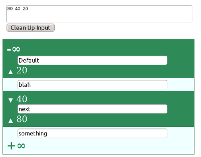
Though it's only a prototype, it offers an efficient angle on this question which starts with a freeform input box. You can paste any text into that box and it will only pay attention to the numeric values (which need not be integers). These numbers are sorted, it will throw out the duplicates, and generate the appropriate non-overlapping bands for you.
Once the bands are formed, you can enter mapped values for each. You can also click on some triangles next to the numbers to indicate if occurrences of that precise value should be considered in the band above -or- below it.
Editing the split points directly on the bands isn't allowed (for now) but you can amend the main text box. If such an edit disrupts the boundaries of bands you've already used then it saves a "history" record to avoid data loss. If that precise band should reappear, the history record is reabsorbed to repopulate it.
You can try it out online to get a feel for how it works:
I wrote this to make a point...
Programmers are clever because they find ways to keep the system from getting into a bad state. If the spec asks for non-overlapping bands you don't want the user accidentally winding up with a dozen identical bands. It's also desirable to stop nonsense like ranges from (0.2 .. Banana). The ability of software to constrain this is a big part of user interface.
However this can lead programmers into a blind spot when looking at this kind of a problem. They make the only elements on the screen ones that correspond to some piece in the final target data structure. UI buttons aren't allowed to break the "programming rules" of that underlying data, so they become tantamount to an exposure of the API for operating on it. The result leads to a modal interface that handcuffs the user.
I avoided that trap by bringing in a freeform text box and a range history, while still keeping the user's eyes on the final data structure. The result let me exploit a lot more of what computers bring to the table, such as sorting the numbers and quickly filtering through information that might even come from a copy/paste.
I'll come back with more detail in this post, but in the meantime you can see examples of what I'm critiquing in the other interfaces here: