On a plane flight, the only reading material I had available was someone else's copy of Joel Spolsky's User Interface Design for Programmers. It's very short... and took about an hour to read:
I'm afraid that I empathize with some of the less positive reviews on Amazon. When people buy texts on user interface instead of reading "some guy's blog," it's usually because they are looking for well-vetted and researched ideas they can apply. But anyone experienced enough to properly take action based on this book's glib advice (like "users don't read!") is probably smart enough to make all the necessary realizations on their own.
Joel nevertheless has an entertaining and frank way of talking about his personal experiences in the software industry. So I think it would come off better with a less ambitious title...like Joel Spolsky's Top Anecdotes About User Interface. The cover could have Joel at a party with a martini, with his hand over the shoulder of a nervous bespectacled guy who's about to get another earful about some Windows dialog box that sucks. :)
I'm not saying that kind of presentation is not useful or fun. In fact, most of my software development conversations are little more than me ranting in that fashion. Then again, I don't charge anyone for it! (To be fair, Joel only charges for "about half" of the book, the rest is free on his website.)
Rather than debate the merits of the book any further, I decided to just write down a few things that reading it got me started thinking about. So begin <rant>...
Learnability vs. Usability
If you're designing emergency exits on airplane, you need to make sure that someone can get the door open without a tutorial. The flight staff is required by law to explain how to work it, but it still needs to be obvious. A person looking at a picture of the exit must be able to accurately answer how it would work without even touching it.
Yet most software doesn't have this life-or-death aspect. So it's acceptable to break a couple of initial expectations or stereotypes that were learned in other programs...if your software's new method has a productivity payoff for the relevant task. The book describes this an interface which is "learnable"--as opposed to one that is immediately "usable".
Using Joel's terminology, I'll say that I've always felt it far more important that software be "learnable". It's sad to me when organizations throw a lot of time into compromising a program's power and beauty...merely to force it to make a mundanely comprehensible first-impression. Much more exciting is when they devote those resources toward exploring clever ways for the program to reveal its novel functionality.
The recent video game LittleBigPlanet impressed me in this regard. Rather than making you sit through a long boring introductory animation, you are given basic control of your character to run it through a "world of credits". The environment contains no enemies or deadly obstacles, so you are gently introduced to the controls in a way that is very pleasing. Here's the very first part of that:
Though I think LittleBigPlanet does this unusually well, practically every video game these days weaves its own tutorial into the gameplay. This is true even though the buttons and game mechanics are radically different! Consumers now expect to be able to learn the game by playing, so game discs aren't really shipping with printed manuals any more.
I think application software is getting ready for a similar renaissance. Screencasting is an easy agent of change--we can now record and narrate a feature in action, and point users around the world to a URL to see it. Media interwoven in smarter applications will hopefully free the hands of software developers from thinking their programs all have to look and feel like Microsoft Excel, and they can focus on the internal consistencies that make their work learnable.
The Persuasive Power of Dirt
Programming enthusiasts often complain that it's limiting to use physical metaphors for software objects. When we train people to model their computer in these mundane ways, they tend to underestimate the real flexibility of the digital medium. Editing a sheet of "paper" on screen may be easy to understand, but it says nothing of the vast difference in capabilities between a digital document and typing paper. So why start people off with something that's cut into 8.5" x 11" sheets?!
Joel mentioned a case I hadn't thought much about, but is clever (or ironic, depending on how you look at it). The "trash can" feature in the Mac OS was added so that as long as you had extra hard drive space, you didn't delete a file immediately...you got to keep it around in case the deletion was an accident and you needed it back. Yet they made a choice to physically draw a non-empty trash can as looking as if it were heaped with garbage.
Note 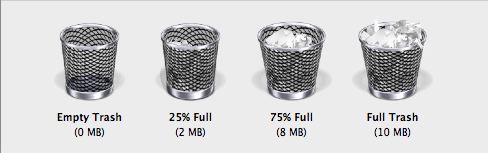
There's a $12.50 utility called "Bin-It" which takes the physicality a bit further and even shows a gradual accumulation of trash proportional to how much data is in it:
...which takes the physicality even further!)
Regardless of whether they need the disk space back or not, many people compulsively empty the trash each time they delete a file. It just bothers them to have "trash" around--as if it would start to smell if they left it too long! Users of this type are getting no advantage by having a trash can instead of instant deletions--their deleted files are gone for ever. Plus they now have some additional work of clicks to empty...instead of just one drag and drop!
When this was mentioned in the book, I realized how I'm certainly influenced by this. I empty the trash because I'm troubled by it being there. Continuing this line of thinking, it made me think about other ways of controlling behavior by using "dirt" and "ugliness" for leverage. If a designer can't stop a user from doing something, then perhaps at least that thing can be made to feel less pretty than doing it right.
In one program I was writing, I used this principle. It was a system like Wikipedia, where a word like "Africa" might resolve to the continent or the rock song by Toto. An unresolved ASCII string was better than nothing--yet I wanted to give a strong visual encouragement to actually invest the work of linking it.
The way I decided to do this was that a "resolved" term would be in a nice proportional font, while an "unresolved" string of characters would be in a blocky proportional font. Here's what it would look like if you left it as the letters A-f-r-i-c-a, while "Bill Bryson" and "visited" pointed to appropriate things:
Bill Bryson visited Africa
It's still readable, and it doesn't go so far as to use red squiggly underlines to suggest an error. But the "junkier" old-typewriter look was enough to motivate people to resolve it:
Bill Bryson visited Africa
I actually considered some other ways of making it ugly, perhaps even making the font and background look like it had been scanned--with some pixelation noise! Anything to hint that something "dirty" was going on. I'd really like to find some more examples of cases like this, where software subtly shows dirtiness through visual feedback that gets them to compulsively "clean up".